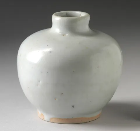
Moon Vase
$148
18 × 19 cm
With a component library
Switch between a piece's size, material and care: the underline slides to the tab, whether you click or use the arrow keys.
$148
Reduced motion: The underline moves to its tab at once, and the panels still fade in.
Tabs need more than buttons: arrow keys between them, Home and End, one tab in the Tab order, and aria-selected and aria-controls kept right. Kobalte's Tabs does all of it. How the selection looks is left to you, and here that's Wardic's: one underline with a layoutId, drawn inside whichever of Kobalte's triggers is selected, slides from tab to tab however the selection changed.
Tabs on a product page builds the same underline on buttons of its own. Here the panels are Kobalte's too: it swaps them as the tab changes, and each new one fades in, a w.create(Tabs.Content).
On Solid 2 it's Kobalte 2.0, still an alpha: the console shows its own development warnings.
On Foldkit the tabs are @foldkit/ui's Tabs, a submodel whose toView hands the page each tab's and panel's attributes, spread onto w.* elements of the page's own: the underline's w.LayoutId sits in the active tab, and the active panel, keyed by its tab, enters afresh each time.
import { Tabs } from "@foldkit/ui"
import { formatPrice } from "@wardic/example-storefront-shared/format"
import { photoOf, srcsetOf } from "@wardic/example-storefront-shared/images"
import { Product } from "@wardic/example-storefront-shared/server"
import * as Effect from "effect/Effect"
import * as Schema from "effect/Schema"
import * as UndefinedOr from "effect/UndefinedOr"
import * as Command from "foldkit/command"
import type { Html, HtmlBuilder } from "foldkit/html"
import { defineMessageUnion } from "foldkit/message"
import { defineView } from "foldkit/submodel"
import { wardic } from "~/lib/wardic.ts"
import { definePage, type PageEnv } from "~/page.ts"
import { Shop } from "~/shop.ts"

// The piece's details, in its catalog's order: its size, its material, its care.
const TABS = ["Size", "Material", "Care"] as const
const Tab = Schema.Literals(TABS)
type Tab = typeof Tab.Type

// The library's tabs, bound to the three: the arrow keys, Home and End, one tab in the Tab order, and
// the roles. Its `toView` hands the page each tab's and panel's attributes, for elements of the page's own.
const Details = Tabs.create<Tab>()

// A panel fades up in each time its tab is chosen.
const fadeIn = {
  initial: { opacity: 0, y: 6 },
  animate: { opacity: 1, y: 0 },
  transition: { type: "tween", duration: 0.2 },
} as const

const Data = Schema.Struct({ piece: Product })
const Model = Schema.Struct({ piece: Product, tab: Tab, tabs: Tabs.Model })
type Model = typeof Model.Type
const Message = defineMessageUnion({ Tabs: { message: Tabs.Message } })
type Message = typeof Message.Type

const details = (model: Model, h: HtmlBuilder<Message>, render: Tabs.RenderInfo<Tab>): Html => {
  const w = wardic.html(h)
  return h.div([], [
    h.div(
      [...render.tablist, h.Class("tabs")],
      render.tabs.map((tab) =>
        w.button([...tab.tab, h.Class("tab")], [
          tab.value,
          // One underline, inside whichever tab is active: its layoutId carries it from tab to tab.
          ...(tab.isActive ? [w.keyed("span")("indicator", [h.Class("tab-indicator"), w.LayoutId("details-underline")])] : []),
        ]),
      ),
    ),
    // The active panel alone, keyed by its tab: a new element each time, entering from `initial`.
    ...render.tabs
      .filter((tab) => tab.isActive)
      .map((tab) => w.keyed("div")(tab.value, [...tab.panel, h.Class("tab-panel"), w.Initial(fadeIn.initial), w.Animate(fadeIn.animate), w.Transition(fadeIn.transition)], [model.piece.details[tab.index]])),
  ])
}

const view = defineView<Model, Message, PageEnv>((model, _env, h) => {
  const photo = photoOf(model.piece.id)
  return h.article([h.Class("product-page details-tabs")], [
    h.div([h.Class("photo")], [h.img([h.Src(photo.small), h.Srcset(srcsetOf(photo)), h.Sizes("(max-width: 720px) 100vw, 420px"), h.Width(String(photo.width)), h.Height(String(photo.height)), h.Alt(model.piece.name)])]),
    h.div([h.Class("product-info")], [
      h.h2([h.Class("name")], [model.piece.name]),
      h.p([h.Class("price")], [formatPrice(model.piece.price)]),
      h.submodel({
        slotId: "details",
        model: model.tabs,
        view: Details.view,
        viewInputs: { tabs: TABS, selectedValue: model.tab, ariaLabel: "About this piece", toView: (render) => details(model, h, render) },
        toParentMessage: (message) => Message.Tabs({ message }),
      }),
    ]),
  ])
})

export default definePage({
  id: "details-tabs",
  Data,
  Model,
  Message,
  load: Effect.map(Shop.use((shop) => shop.getProduct("moon-vase")), (piece) => ({ piece })),
  init: ({ piece }): Model => ({ piece, tab: "Size", tabs: Tabs.init({ id: "details" }) }),
  update: (model, message) =>
    Message.match(message, {
      // The library's step, folded: its Model kept, its Commands wrapped, and the tab it selected taken.
      Tabs: ({ message }) => {
        const step = Details.update(model.tabs, message)
        const tab = UndefinedOr.match(step.outMessage, { onUndefined: () => model.tab, onDefined: ({ value }) => value })
        return { model: { ...model, tabs: step.model, tab }, commands: Command.mapMessages(step.commands, (inner) => Message.Tabs({ message: inner })) }
      },
    }),
  view,
})